Read Time: 3 Minutes
You know what’s cool? Even after 16 years of AcuGraph, I still get to learn new things! Every now and then after completing a graph, I still manage to run across something that makes me shake my head, say, “Hmmm. I wonder why that is…?” and start experimenting.
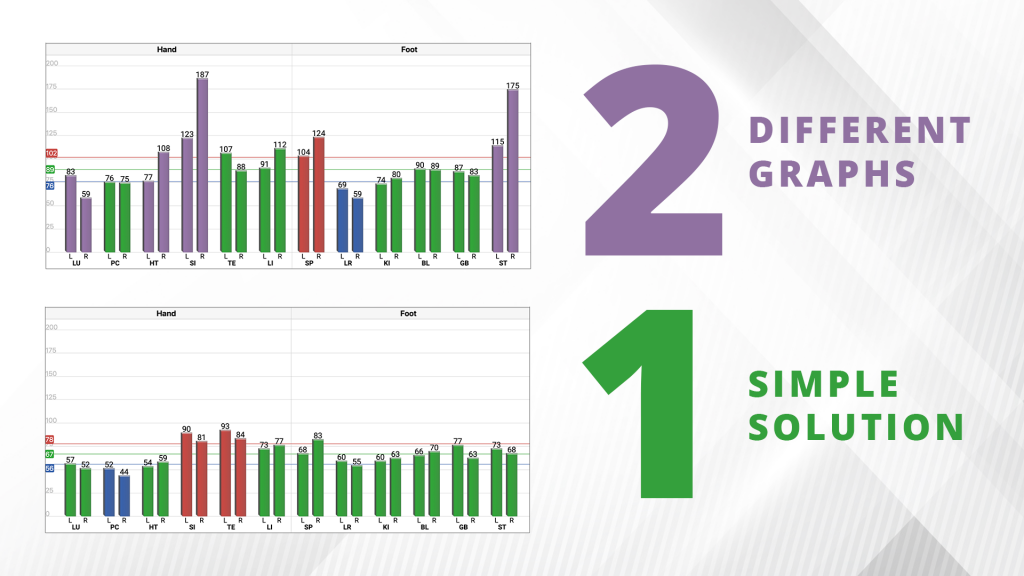
Quite a Messy Graph
I had such an occasion recently when I performed an AcuGraph exam on a regular patient. I’m pretty experienced with this patient, and I thought I knew the sort of thing to expect. So when I encountered a bunch of anomalous readings, I began to wonder, “What changed?” Take a look at the graph and see for yourself.

Notice the huge splits in SI and ST, the spike in spleen, and the HUGE range of the graph, from a low of 59 to a high of 187. That’s quite a messy graph.
I couldn’t imagine why things were showing up this way, but things simply didn’t feel “right.” I began to wonder about the equipment itself. Now, AcuGraph self calibrates during reading, so there’s no chance the system had lost “calibration” or some such issue. It’s all computerized electronics, and if one reading is correct, they are all correct. The variability was certainly not coming from the equipment.
Next, I got to thinking about the patient’s skin, whether there was some sort of inflammation or problem near some of the source points. But everything looked good. Skin was cool and dry, no signs of rash or inflammation.
Hmmm.
Skin/Probe Interface?
I thought through the exam process, and remembered that the skin/probe interface is the most finicky part of the entire circuit that gets created during measurement. This is one reason we use a moistened cotton tip—the water helps normalize the skin conductance so the probe can make a better electrical connection with the point being measured. In simple terms, if there’s a problem, this is a good place to look.
So I took a closer look at the cotton tip, and I’m embarrassed to say, I found the problem. Here’s a picture of that tip. As you can see, the tip is rather crushed and flattened. It’s clearly been used past its prime. And it’s kind of hard to tell fully from the photo, but the tip is also quite dirty and gray looking. Compare it to a new tip.

Once I took a good look at the tip and realized its condition, I changed the tip and tried the exam again.
Take a look at the results with a new tip. This second graph was just 4 minutes later. Notice how all the spikes have gone, things are much more in balance, and the range of the graph (44-93) is much more manageable. Best of all, the splits all disappeared.

Being the inquiring type, I got to wondering about the actual resistance variability of the used tip vs. the new tip, so I did a few experiments. Here I am measuring the old, used tip, vs the new, clean tip.

The used tip measured about 534kΩ, while the new tip measured 686kΩ, for a difference of about 150kΩ between old and new. This is enough to make a huge difference in reading reliability.
The Take-Home Point
So here’s the take-home point: Change your tips—often! Used, crushed, dirty tips tend to become more conductive (from absorbing salts and oil, I presume) and tend to have a larger surface area, from crushing. Luckily tips are very cheap, easily changed, and readily available. Just one more lesson to keep in mind—and an eye-opening study for me!
Wishing you Many a Green Graph,
Adrian
