Have you ever been to a healthcare office that had downright ugly—or even inappropriate—charts and posters on the walls?
I remember once as a child, I was in a doctor’s office that had this problem in spades. There were faded, wrinkled, and even torn posters literally TAPED to the walls, and there was a particularly ugly one taped to the ceiling over the exam table, so when you were on your back you were staring at the insides of someone on the ceiling who was staring back at you. Those images really stuck with me, and NOT because they were impressive. I vowed that when I opened my practice, everything on the walls would be quality, tasteful, appropriate, and professional.
Now, I don’t want to step on any toes, but when was the last time you looked at your walls with a critical eye? What is the first impression a patient gets when walking into your practice? What will your patient assume about you? About your training and education? About your attitude? About acupuncture?
When I opened my practice, I looked long and hard for good acupuncture wall charts, and found some pretty good ones. But they all left something to be desired. So here at Miridia we set out to design the ultimate acupuncture wall chart.
How would you design the ultimate acupuncture wall chart? 
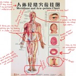
We started with all the problems seen in so many other charts: Foreign lettering, poor illustrations, missing or incorrect information, nude genitals, crowded symbols, the list goes on. We analyzed every chart we could find, sometimes with humorous results.
(Click the marked up chart for an enlargement)
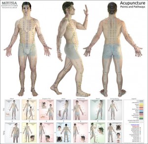
We then solved every problem we encountered, and created the best chart we’ve ever seen.
Here are some of the features that make it so great:
-
- Our chart is built on actual human photos, not cartoon illustrations. You’ll see what the landmarks actually look like, not just what an illustrator imagined.
 Tired of wasting your time searching through minutia to find something important? We sorted through all the information typically included on charts—some is important to have readily available, and some are just extra filler. We kept the important clinical information you need and eliminated the fluff. Result: A less-crowded, more useful chart.
- A chart shouldn’t confuse you. That’s why every point is clearly labeled and color-coded in English, using only internationally accepted names and abbreviations. (Spanish is on the way!)
- We all know where CV 1 is, and probably never needle it anyway. So the naughty bits are covered up. No need for your patients (or their children) to be uncomfortable in your office.
- Are you tired of squinting at tiny or multiple charts? We made our chart large, 36″ by 36″ so it’s easy to see exactly what you’re looking for.
This chart makes a beautiful and useful addition to the home or office of any acupuncture practitioner or enthusiast. Printed on high-quality, glossy stock at photographic resolution, you’ll use and enjoy this chart for years to come. Want one? 
